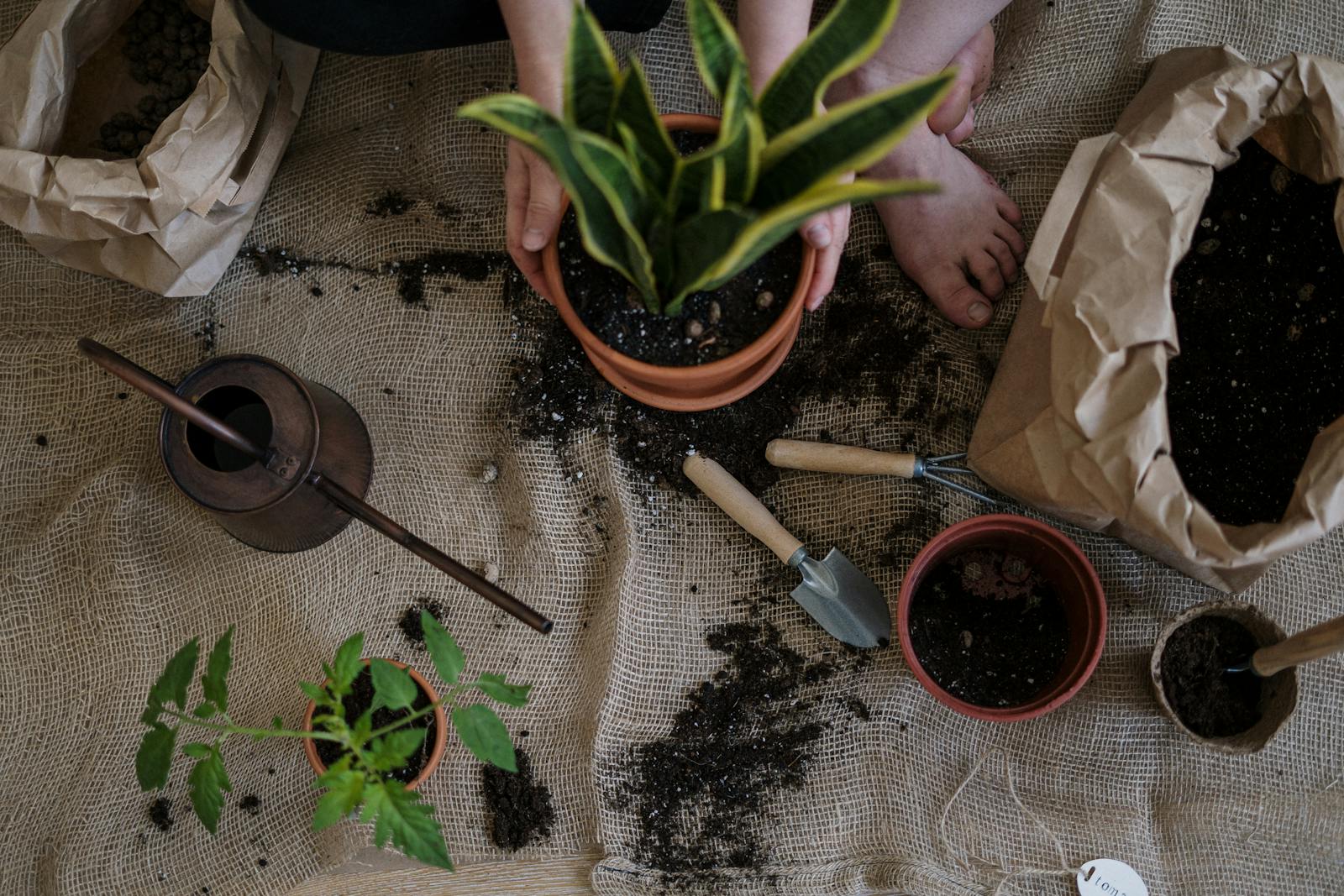
Color Themes and Plant Pairings for Stunning Garden Design
Why Color Themes Matter in Garden Design
Choosing intentional color themes and plant pairings transforms your garden from a collection of plants into a cohesive, artistic space. Colors influence how we feel—cool hues like blue and purple create a calm retreat, while warm tones like red and orange energize and draw attention.
Color schemes also provide visual continuity, helping your space feel more balanced. Whether you want a soft, pastel cottage garden or a bold tropical border, starting with a clear color palette is key. With thoughtful planning, your garden can evoke mood and movement with every bloom.
Understanding the Color Wheel for Plant Pairings
The color wheel is a powerful tool for selecting harmonious plant combinations. Complementary colors—like purple and yellow—create dynamic contrast, while analogous colors—like red, orange, and yellow—blend smoothly for a flowing, unified look.
Triadic schemes (three colors evenly spaced on the wheel) offer vibrancy without clashing. Use these principles to guide your color themes and plant pairings, making it easier to combine flowers, foliage, and accent features that pop. Keep the intensity consistent—pair pastels with pastels, or bold hues with equally vivid partners.
Monochromatic Gardens: A Study in Simplicity
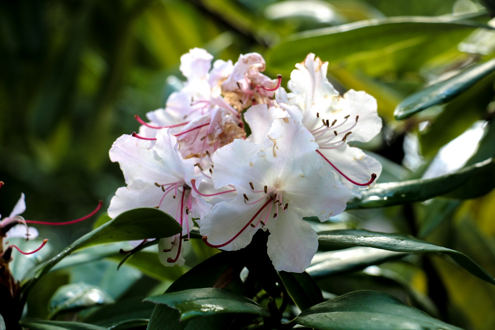
A monochromatic garden uses different shades of one color to create elegance and depth. All-white gardens, for example, feel clean, calming, and luminous—especially in evening light. Blue-themed gardens offer serenity, while green-on-green textures feel lush and sophisticated.
To make a monochromatic garden dynamic, play with shape, size, and texture. Mix tall spires like delphinium with mounded plants like salvia or ornamental grasses. This subtle approach to color themes and plant pairings lets foliage, form, and structure take center stage.
Bold and Bright Combinations That Pop
If you want a garden that grabs attention, go bold with high-contrast color themes and plant pairings. Pair hot pinks with oranges, or purples with bright yellows for visual excitement. These schemes work well in focal areas like entryways or outdoor entertaining spaces.
Use mass plantings to anchor the look, then intersperse accent plants for bursts of brightness. Zinnias, marigolds, salvias, and canna lilies all lend vibrant energy and work well in hot-themed borders. Don’t forget the role of dark foliage—plants like coleus or purple basil ground bright blooms beautifully.
Cool and Calming Color Schemes
For a restful garden vibe, choose cool shades like blue, violet, and silver. These colors recede in the landscape, making small spaces feel larger and promoting relaxation. They work well in shaded gardens, meditation spaces, or as evening backdrops.
Combine lavender, Russian sage, and catmint with silvery foliage from lamb’s ear or dusty miller. These soft combinations thrive in sun and part shade and bloom through summer. With these gentle color themes and plant pairings, your garden becomes a peaceful, rejuvenating retreat.
Warm Tones for Energy and Vibrance
Warm colors—like red, orange, and yellow—bring energy and excitement to any garden. These hues are ideal for creating a lively atmosphere near patios, decks, or entrances. They draw the eye forward and can make open spaces feel more intimate and inviting.
Pair bold dahlias with golden rudbeckia, or fiery crocosmia with orange zinnias. Add variegated foliage or ornamental grasses for texture. With the right balance, these vivid color themes and plant pairings make your garden pop with personality and charm from spring through fall.
Designing with Foliage Colors
Foliage plays a key role in garden color schemes. While flowers come and go, colorful leaves provide long-lasting interest. Incorporate plants with silver, burgundy, chartreuse, or blue-green foliage to support your chosen palette and add contrast throughout the season.
For example, pair golden hostas with purple heuchera or blue fescue with coral-colored begonias. These foliage-based color themes and plant pairings anchor beds, frame borders, and create structure that shines even when blooms fade. Use foliage as your base and let flowers play a supporting role.
Using White and Neutral Accents
White flowers and silvery foliage act as visual breathers in colorful gardens. They brighten shady spots, reflect moonlight, and soften transitions between strong colors. Neutrals like green, gray, and cream also help balance intense color combinations.
Try pairing white cosmos, daisies, or gaura with any bold scheme to add harmony and light. Neutral grasses and ferns offer soft texture and movement. Strategic use of white and neutral elements within your color themes and plant pairings enhances flow and visual comfort.
Seasonal Color Planning
To maintain visual interest year-round, choose plant pairings that bloom in succession. Start spring with bulbs like tulips and daffodils in complementary hues. Follow with summer perennials such as echinacea and salvia, and finish with fall color from asters and ornamental grasses.
Incorporate evergreen shrubs, colorful bark, or berries for winter appeal. Blending these elements into your color themes and plant pairings ensures your garden always has something to offer. Planning by bloom time creates a rhythmic display that evolves beautifully throughout the year.
Companion Planting with Color in Mind
Companion planting isn’t only practical—it can be beautiful too. Pair vegetables and herbs with flowering companions that complement in both function and color. For example, purple basil next to orange marigolds, or lavender near blue sage.
Let edible and ornamental plants share space in raised beds or containers using harmonious palettes. These dual-purpose color themes and plant pairings support pollinators, deter pests, and keep your garden looking vibrant and well-designed at the same time.
Designing Garden Rooms with Color
Color can help define garden “rooms” or zones, guiding movement and setting mood in each area. Use cool tones like blues and greens for quiet reading spots, and energizing colors like orange and red near dining or play areas. Consistent palettes create cohesion and enhance spatial flow.
Hedges, trellises, and archways can frame these zones while supporting your chosen palette. This strategic use of color themes and plant pairings allows you to craft experiences in the garden—each one reflecting purpose, personality, and seasonal charm.
Color Themes for Pollinator Gardens
Color plays a critical role in attracting pollinators. Bees love blue, purple, and yellow flowers, while hummingbirds favor red and orange. Butterflies prefer wide landing pads in bright shades. When designing for pollinators, aim for diversity and blooms throughout the season.
Try pairings like yellow coreopsis with purple salvia, or red monarda with golden sneezeweed. Group colors in clusters to make it easier for pollinators to locate nectar. These color themes and plant pairings not only look beautiful—they help sustain vital garden ecosystems.
Color Themes for Shade Gardens
Shady gardens benefit from cool, luminous tones that brighten dim areas. Think soft blues, pale pinks, creamy whites, and variegated foliage. These colors reflect available light, making your shaded spots feel more inviting and open.
Pair hostas with ferns, foxgloves with impatiens, or astilbe with heuchera for layered, textured compositions. Choose plants that bloom under filtered light and match well in both form and hue. Color themes and plant pairings for shade create tranquil escapes where every leaf and bloom matters.
Incorporating Color into Hardscapes
Don’t forget to echo your garden’s color palette in your hardscapes. Painted trellises, glazed pots, furniture cushions, and path materials can reinforce your theme. For instance, a cobalt bench can extend a cool blue scheme, while terracotta containers warm up sunny borders.
Keep accents simple so they enhance rather than compete. Repeating key tones throughout your garden in both plants and structures strengthens the visual narrative. When color themes and plant pairings extend to your design elements, the entire space feels cohesive and curated.
Build Your Palette, Then Let Nature Inspire
Whether you prefer monochromatic elegance or bold combinations, successful garden design starts with a thoughtful color palette. Use plant pairings to build texture, flow, and contrast, while keeping seasonal interest and pollinators in mind.
But don’t be afraid to improvise—some of the best gardens evolve organically. Start with a plan, then adjust as new blooms or ideas take root. With a blend of intention and inspiration, your use of color themes and plant pairings can transform any space into a personal paradise.
Frequently Asked Questions
How do I choose a color theme for my garden?
Start by considering the mood you want to create. Cool colors like blue and purple promote calmness, while warm tones like red and orange add energy. Use a color wheel to choose complementary, analogous, or monochromatic schemes. Think about your garden’s lighting, architecture, and existing elements to guide your palette. Begin with a few anchor plants and build around them with harmonizing hues. Once you establish a base, use textures and foliage to add depth. A clear color theme makes plant pairings easier and your overall garden more cohesive and visually pleasing.
What are the best plant pairings for bold color schemes?
For bold gardens, combine high-contrast blooms like yellow coreopsis with purple salvia or red zinnias with orange marigolds. Use vibrant foliage like purple coleus or chartreuse sweet potato vine for added impact. Mass plantings of bright flowers provide strong visual anchors, while filler plants like grasses or neutral-tone blooms soften transitions. Choose plants that thrive under similar growing conditions—sunlight, soil, and moisture—to ensure the combinations are not only striking but sustainable. Bold color themes and plant pairings work best in entryways, containers, or entertaining areas where you want maximum visual excitement.
Can color themes work in small or shaded gardens?
Yes, color themes and plant pairings can be especially effective in small or shaded spaces. Use cool tones like blue, white, and soft pink to brighten low-light areas and create a sense of openness. Plants like hostas, astilbe, and impatiens thrive in shade and offer diverse colors and textures. In small gardens, choose a limited palette to avoid visual clutter and focus on layering different shapes and heights for interest. Accent with pots, stones, or trellises in coordinating colors to extend your theme and make the most of every inch.
How do I incorporate foliage into my color palette?
Foliage provides structure and long-lasting color even when flowers fade. Look for plants with silver, burgundy, gold, or variegated leaves to complement your blooms. For example, pair golden hostas with purple heuchera, or silver artemisia with pink coneflowers. Use foliage to echo or contrast your chosen flower colors, and layer textures to keep things visually interesting. Grasses, ferns, and shrubs can also play a major role in color themes and plant pairings. Since foliage lasts longer than flowers, it ensures color continuity throughout the seasons.
What role do pollinators play in color-themed gardens?
Pollinators are drawn to specific colors, so color themes and plant pairings can support their habitat while enhancing garden beauty. Bees prefer blue, purple, and yellow, while butterflies are attracted to red and orange. Choose clusters of colorful, nectar-rich flowers like coneflowers, bee balm, and black-eyed Susans to attract and support pollinators. Design your garden with bloom succession in mind to provide food throughout the growing season. This approach adds movement and biodiversity to your garden while reinforcing your color palette with pollinator-friendly choices.
© 2025 GardeningandDecor.com. All rights reserved.