Color Schemes in Home Decor
Introduction to Color Schemes in Home Decor
Why Color Matters More Than You Think
Imagine walking into a room that immediately calms your nerves or lifts your spirits. That magical feeling? It’s not just the plush sofa or elegant chandelier—it’s the colors speaking to your senses. Color is much more than an aesthetic choice in home decor. It’s the silent language that sets the emotional tone of a room, defines spatial dynamics, and influences the way you feel inside your home.
Colors can trick the eye: light shades can make a cramped room feel spacious, while darker hues can create cozy, intimate vibes. Colors can also define the character of your home, from serene coastal blues to vibrant Moroccan reds. Therefore, understanding and intentionally selecting color schemes is essential when you want your home to feel not just decorated, but deeply designed.
Emotional Impact of Colors in a Living Space
Ever wonder why restaurants often use red and orange tones? Those colors stimulate appetite. Or why spas lean heavily into muted greens and soft whites? They promote relaxation. In home decor, the emotional impact of color is profound. Blue, for example, is associated with calm and trust—perfect for bedrooms and bathrooms. Yellow evokes happiness and energy, making it great for kitchens or playrooms.
It’s not just about picking your favorite color. It’s about using color psychology to craft environments that support your emotional well-being. Each room in your home serves a different purpose, and the color should reflect that function. A home office might benefit from energetic greens, while a meditation corner would thrive with cool, soothing shades.
The Basics of Color Theory
Understanding the Color Wheel
Let’s start with the foundation: the color wheel. Think of it as your secret weapon for decorating like a pro. The traditional color wheel arranges primary, secondary, and tertiary colors in a circle, demonstrating their relationships. When you understand this wheel, choosing harmonious color combinations becomes second nature.
Adjacent colors, opposite colors, and colors that form perfect triangles on the wheel all have distinct visual relationships. Mastering the color wheel allows you to anticipate how different shades will interact in your home, whether creating contrast or harmony.
Primary, Secondary, and Tertiary Colors
Here’s a quick refresher:
- Primary Colors: Red, Blue, Yellow. These are pure colors that can’t be created by mixing other hues.
- Secondary Colors: Green, Orange, Purple. These are formed by mixing two primary colors.
- Tertiary Colors: These are the six shades you get by mixing a primary color with a secondary one (like red-orange or blue-green).
In home decor, understanding these groups helps you curate a palette that feels natural rather than chaotic. Tertiary colors, in particular, are great for creating more sophisticated and subtle interiors.
Warm vs. Cool Colors
This distinction is fundamental. Warm colors (reds, oranges, yellows) evoke energy and warmth. They’re perfect for social spaces like living rooms and dining areas. Cool colors (blues, greens, purples) bring calmness and are ideal for bedrooms and bathrooms.
Balancing warm and cool tones can make a room feel well-rounded and inviting. For example, a predominantly cool-toned room can feel sterile if you don’t add warm accents. Similarly, a room that leans too warm can feel overwhelming without cooler elements to mellow it out.
Popular Types of Color Schemes
Monochromatic Color Scheme
A monochromatic color scheme uses variations in lightness and saturation of a single color. Imagine a room entirely decorated in shades of blue: navy curtains, sky-blue walls, and powder-blue pillows. The result? A space that feels cohesive, soothing, and sophisticated.
This approach is excellent for smaller rooms where a busy palette might be too overwhelming. However, layering textures—like mixing a velvet navy couch with a smooth silk throw—is essential to prevent the space from feeling flat.
Analogous Color Scheme
Analogous schemes involve using colors that sit next to each other on the color wheel, like blue, blue-green, and green. These combinations create a rich, harmonious look because they mimic what we often see in nature (think sunsets or oceans).
Analogous palettes are foolproof for beginners: they offer variety without the risk of clashing. If you want a relaxed, visually pleasing space without much guesswork, analogous is your go-to.
Complementary Color Scheme
This one’s a classic for a reason: complementary schemes use colors opposite each other on the color wheel, like blue and orange or red and green. The contrast is striking and dynamic, perfect for creating a bold statement.
But a word of caution: strong complementary colors can be intense. One trick is to choose a dominant color and use its complement sparingly, like an accent wall or decorative pieces.
Triadic Color Scheme
Triadic color schemes involve three colors evenly spaced around the color wheel (like red, yellow, and blue). They offer a lively but balanced feel, often producing vibrant and energetic spaces.
When using a triadic scheme in home decor, it’s wise to let one color dominate while the other two serve as accents. This approach maintains visual balance and prevents sensory overload.
Tetradic (Double-Complementary) Color Scheme
Feeling adventurous? Tetradic schemes use two pairs of complementary colors. For example, blue and orange paired with purple and yellow. This creates a rich, multifaceted look that’s bursting with variety.
Tetradic schemes demand careful planning to avoid visual chaos. Ideally, one color should take the lead, while the others support in measured doses. This style works best in large, open spaces where you have room to balance multiple bold tones.
How to Choose the Right Color Scheme for Your Home
Assess Your Space
Before you grab the paintbrush, take a long, hard look at your space. Notice the amount of natural light, the ceiling height, the floor material, and even your existing furniture. Dark rooms might benefit from lighter colors to add brightness, while sun-drenched rooms can handle deeper, more saturated shades.
Use the room’s features to your advantage. A room with beautiful molding might look stunning in a bold, saturated hue, while minimalistic spaces thrive on soft, understated palettes.
Consider the Lighting
Lighting can make or break a color scheme. A color that looks cheerful and bright under showroom lighting may appear drab and lifeless in your living room. Always test paint swatches under different lighting conditions—morning sun, afternoon light, and evening bulbs.
Pay attention to the type of artificial lighting, too. Incandescent lights bring out warm tones, while fluorescent lights tend to enhance cooler shades.
Match Your Mood and Lifestyle
Think about the vibe you want for each room. Do you want your bedroom to feel restful and serene? Cool blues and muted greens might be perfect. Dreaming of a lively kitchen bustling with energy? Sunny yellows and vibrant reds can do the trick.
Also, consider your lifestyle. If you have young kids or pets, ultra-light color schemes may be harder to maintain. Opt for tones that offer a forgiving backdrop for everyday life.
Trending Color Schemes for 2025
Nature-Inspired Palettes
In 2025, the trend is swinging back to nature—think earthy browns, leafy greens, and soft sky blues. These nature-inspired palettes create grounded, calming spaces that feel like a breath of fresh air. As people increasingly seek a retreat from technology and chaos, they’re turning to colors that mimic the outdoors for peace and tranquility.
These colors work wonderfully in every part of the home. A living room with olive green walls, tan furniture, and leafy accents feels like an indoor oasis. Pair that with natural textures like rattan, jute, or wood, and your home becomes a restorative haven. It’s not just about green—try pairing terracotta with sandy beige or sage with soft cream for a subtle, elegant effect.
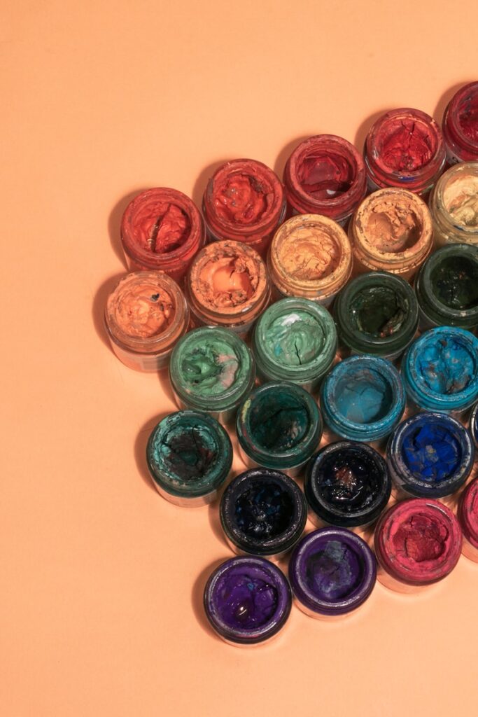
Bold Jewel Tones
If you’re ready to turn heads in 2025, jewel tones are making a luxurious comeback. Rich emerald greens, sapphire blues, amethyst purples, and ruby reds add drama, depth, and decadence to any room. These colors are perfect for those who aren’t afraid to make a statement.
The beauty of jewel tones is that they can elevate even the simplest room into something chic and sophisticated. Try deep navy walls with gold accents or a lush velvet emerald couch in a neutral room. The key here is balance: let the bold color take center stage while keeping the supporting elements understated.
Soft Pastels and Neutrals
On the flip side, pastels and neutrals are still reigning supreme in minimalist and Scandinavian-inspired homes. Think soft blush pinks, pale lavender, creamy taupe, and muted greys. These colors are perfect for creating bright, airy spaces that exude calm and simplicity.
What’s different in 2025 is the move toward warm pastels and earthy neutrals. Instead of sterile grays, people are opting for greige (gray + beige), and instead of icy pastels, they’re using dusted tones that feel lived-in and cozy. These shades work beautifully with natural wood, stone, and textured fabrics.
Color Schemes by Room
Living Room Color Ideas
The living room is the heart of your home, and the color scheme here sets the tone for your entire space. For a cozy, welcoming vibe, many designers in 2025 are leaning into warm neutrals like caramel, rust, and deep ivory. These shades make the space feel inviting and grounded.
If you want a more dramatic, modern feel, go for high-contrast combinations like charcoal walls with crisp white trim or navy blue paired with brass accents. Or, if you’re drawn to eclectic styles, try layering multiple shades from the same color family—for example, coral, peach, and terracotta. Add personality through colorful throw pillows, art, and rugs.
Lighting is crucial in the living room, so choose colors that complement both your natural and artificial lighting sources. A shade that looks dull in daylight might come alive under warm-toned bulbs.
Bedroom Color Inspirations
Your bedroom should be your sanctuary, and color is one of the fastest ways to make it feel that way. Soothing palettes like soft blues, pale greens, and muted purples help encourage relaxation and sleep. They bring a spa-like calmness that’s ideal for winding down after a long day.
For a more modern or luxurious twist, opt for darker tones like charcoal gray, deep plum, or forest green. Pair them with soft lighting, plush textures, and light-colored linens for balance. Accent walls are popular here too—a deep teal or dusky rose behind the bed can add depth without overwhelming the room.
Avoid loud, energizing colors like bright red or electric yellow in bedrooms unless they’re used very sparingly.
Kitchen Color Combinations
The kitchen is where functionality meets creativity, and the color scheme should reflect that balance. In 2025, warm whites and creamy neutrals are dominating kitchen trends, especially when paired with natural wood cabinetry and matte black fixtures.
For more color, soft sage green cabinets or navy-blue islands are popular options. They offer character without being overpowering. You can also experiment with two-tone schemes—upper cabinets in white, lower ones in a contrasting shade.
Backsplashes and accessories are a great place to introduce pops of color. Think terracotta tiles, pastel utensils, or even colorful bar stools to keep things vibrant and fresh.
Bathroom Color Themes
Bathrooms might be small, but that doesn’t mean their color schemes should be boring. Light, clean tones like pale grey, seafoam green, and powder blue continue to be popular. They make bathrooms feel fresh and serene, which is ideal for a space that should feel clean and calming.
On the bolder side, dark moody hues like charcoal, navy, or emerald are trending, especially in powder rooms or master baths. These colors create a luxurious, almost spa-like vibe, especially when paired with metallic accents and natural stone textures.
You can also use tile color to your advantage. Muted pastel tiles or mosaic patterns can add interest and color without overwhelming the space.
Mistakes to Avoid When Choosing Color Schemes
Ignoring Undertones
One of the most common and frustrating mistakes in home decor is ignoring undertones. Two shades of “white” can look drastically different depending on whether they have warm (yellow/red) or cool (blue/green) undertones. Matching these incorrectly with other elements like flooring or countertops can throw off the entire room.
Before committing, always compare your chosen colors in the room’s actual lighting. Bring home large paint swatches or samples and observe how they look throughout the day. You’ll be surprised at how much undertones can affect the final outcome.
Overwhelming the Space with Too Many Colors
Variety might be the spice of life, but in home decor, too much spice can ruin the dish. Using too many colors in one space can make it feel chaotic and disconnected. A good rule of thumb is the 60-30-10 rule: 60% dominant color, 30% secondary, and 10% accent.
Stick to a maximum of three main colors per room to keep things cohesive. If you love lots of color, use accessories like cushions, art, or rugs to introduce extra hues without overpowering the main palette.
Forgetting About Flow Between Rooms
Your home isn’t just a collection of individual rooms—it’s a continuous space. Color schemes that clash from room to room can make your home feel disjointed. While each room can have its own personality, there should be a sense of flow.
This can be achieved by using a base color that appears throughout your home in different ways—maybe as a wall color in one room, an accent piece in another, or textiles in a third. Consistency builds harmony, even in an eclectic home.
Practical Tips for Implementing Color Schemes
Starting Small with Accessories
If the idea of committing to a new color scheme makes you nervous, start small. Use accessories—like throw pillows, blankets, art, vases, and curtains—to test the waters. These elements are low-risk and easy to swap out if you change your mind later. It’s a great way to experiment with bolder hues or trendy colors without overhauling your entire space.
Start with a neutral base and add color through accents. For example, a beige sofa can be livened up with teal pillows or a mustard throw. Once you’re confident with the palette, you can expand it to larger elements like area rugs, wall paint, or furniture pieces.
The best part? Accessories allow for seasonal updates. Warm, cozy colors in the fall can be replaced by fresh, vibrant tones in spring. It keeps your space feeling dynamic and refreshed all year round.
Testing Paint Samples Before Committing
Never, and we mean never, skip this step. Paint looks drastically different depending on lighting, wall texture, and even the direction your room faces. That beautiful greige you saw on Pinterest might look purple in your hallway.
Buy small sample cans and test them on large poster boards or directly on your wall. Observe them over several days under different lighting conditions—morning, afternoon, evening, and artificial light. This step helps you avoid costly mistakes and ensures you’re truly happy with the color you choose.
Also, test next to permanent elements—like flooring, countertops, and furniture—to see how they all interact. This simple step is often the difference between a harmonious palette and a design regret.
Using Technology and Apps for Visualization
Thanks to tech, experimenting with color has never been easier. There are dozens of free and paid apps that let you visualize color schemes in your actual space before picking up a paintbrush. Apps like Sherwin-Williams ColorSnap, Benjamin Moore Color Portfolio, and Pantone Studio allow you to upload photos and test different hues.
These tools are incredibly helpful for seeing how a full room will look in different shades. Some even let you match paint colors to a fabric swatch, favorite photo, or piece of artwork. They’re perfect for building confidence in your choices and narrowing down your options without lifting a roller.
How to Blend Indoor and Outdoor Color Schemes
Creating a Seamless Transition
Blurring the line between indoors and outdoors is one of the hottest trends in home design. To achieve this, create a sense of visual continuity by using complementary color palettes in both spaces. For example, if your living room opens up to a patio, use similar shades to link the two—like pale blue cushions inside and matching ceramic planters outside.
You don’t need to mirror the exact colors. Just aim for harmony. If your indoor palette is full of earthy tones, echo those in your outdoor materials—think terracotta pots, beige patio umbrellas, or warm wood furniture. This unifies your home’s overall aesthetic and makes transitions feel effortless.
Choosing Outdoor Furniture Colors
Outdoor spaces don’t have to be dull or strictly neutral. Bring in vibrant hues like coral, teal, or emerald through cushions, rugs, and decor. These colors not only stand out against natural backdrops but also connect back to indoor themes if chosen wisely.
Weather-resistant fabrics and paints now come in a wide range of colors, allowing for creative freedom. Just be sure your outdoor color palette complements the surrounding landscape. The goal is cohesion, not competition with nature.
Matching Your Garden Decor
Your garden decor should also contribute to the overall color narrative. Choose flowers, pots, and furniture that align with or gently contrast your indoor palette. For instance, if your interior is filled with cool blues and greens, consider planting hydrangeas, lavender, or succulents outdoors.
Decorative items like lanterns, wind chimes, or wall art can echo indoor colors and create a cohesive theme. Even your shed, fence, or front door can be painted to tie everything together. Thoughtfully chosen outdoor colors enhance curb appeal and make your entire property feel intentional and stylish.
Crafting a Beautiful, Harmonious Home
Color schemes are more than just combinations—they’re the soul of your home’s style. With the right hues, you can create warmth, express personality, set moods, and even shape how large or cozy a room feels. From understanding basic color theory to navigating the latest 2025 trends, the key lies in intention and experimentation.
Take your time. Start small. Use the tools and tips at your disposal. And most importantly, trust your instincts. When you choose colors that make you feel good and fit your lifestyle, your home will always look—and feel—just right.
FAQs
How do I pick a color scheme for a small room?
Opt for light colors like soft neutrals or pastels to create the illusion of more space. Mirrors and reflective surfaces can also help bounce light around. Avoid dark, heavy hues unless used sparingly as accents.
What’s the safest color scheme for resale value?
Neutral tones—like beige, gray, white, and greige—are your safest bet. They appeal to a wide audience and allow potential buyers to envision their own decor style.
How many colors should I use in one room?
Stick to the 60-30-10 rule: 60% dominant color, 30% secondary, and 10% accent. This keeps the space balanced and visually appealing without being overwhelming.
Can I mix different color schemes in one house?
Absolutely, as long as there’s a common thread. Use a base color or tone throughout your home to maintain flow, even if each room has its own unique flair.
What’s the best way to test a color scheme before painting?
Use paint samples on poster boards or directly on walls, and observe them under various lighting conditions over a few days. Use mobile apps to visualize full-room changes before committing.